Why should you choose A.1 Business Pte Ltd?
* We pledge to provide Quality and Excellent Customer ServiceProviding the best customer service is our top priority. In order to offer expert advice, our team is well knowledgeable and constantly updated with new information , certain to benefit our clients substantially.
*Value for Money
We are committed to provide value as well as quality for money to our clients.
*All in One Service
With our extensive experience and knowledge in the full spectrum of setting up businesses to other business needs, we are able to better understand the complexities and dynamics of business set up. Capable to guide our clients in every step of their entrepreneur journey from company registration to other related services, making us a truly 1 stop business solutions provider in Singapore.
* Efficient Service
We respond actively to each and every of our customers’ enquires. By presenting the most effective solutions available, we seek to maximise customer satisfaction.
*Abundance of Experience
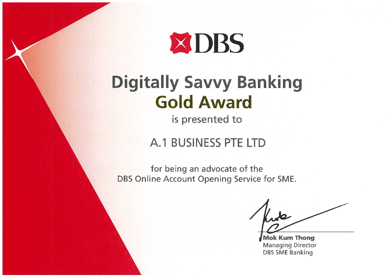
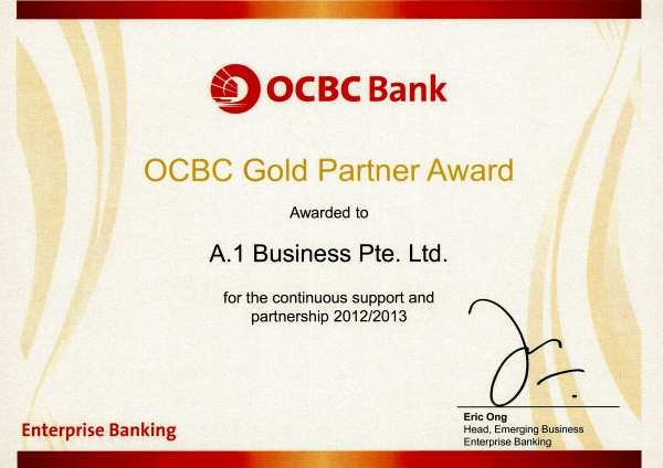
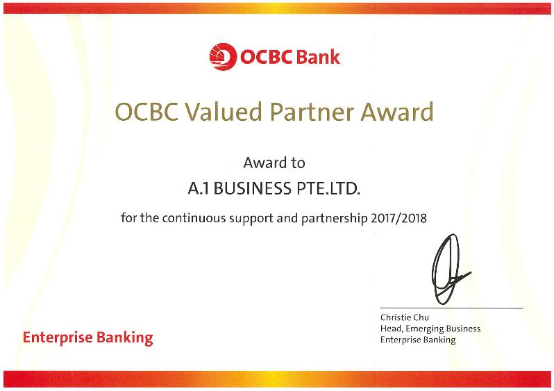
Being in operation for the past 10 years, we have helped numerous new startups and established companies.
16 Years
in Business
1,850+
Awesome Clients
20,000+
Success Works
Unlimited
Service and Advice